
Easy one - Overview section of Alarm Details - increase to 50 before scrolling
-
In Alarm Details screen, the Overview section is dynamic, starting at 5 and expanding to 13 before turning into a scrolling section for the remainder.
Related events will expand down if Comments and DCI Data are minimised, but not Overview - which is where the important information is.
Can Overview please be set such that it will display either display up to 50 before turning into a scroller - or have that number be s system variable able to be set by a user.
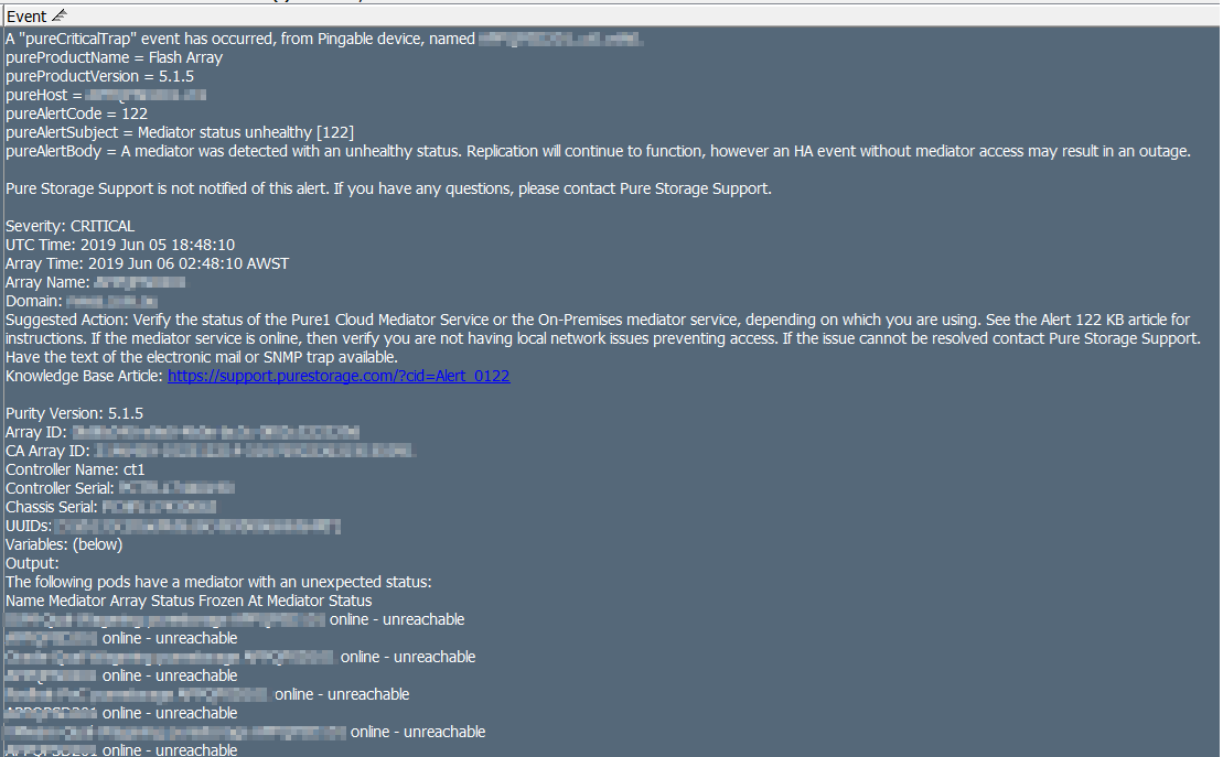
As per below - a 39 line trap that I need to see all the lines of - especially the last ones. When a SAN controller panics, details, and speed, are critical.
You can also set the default section size of Comments and Related Events smaller so that all are still visible - with the Overview being completely visible.
-
In a strange twist - visibility via the tool-tip when hovering over alert in Alarm Browser, does not have the limitation. This gets us around this being a major impact and instead, is an annoyance that we hope gets adjusted at some point.
It just really stands out by having 2 or three events and the rest of that empty, a comments section - also empty, and the Alarm Overview that has to scroll to see the whole alarm.
Hello! It looks like you're interested in this conversation, but you don't have an account yet.
Getting fed up of having to scroll through the same posts each visit? When you register for an account, you'll always come back to exactly where you were before, and choose to be notified of new replies (either via email, or push notification). You'll also be able to save bookmarks and upvote posts to show your appreciation to other community members.
With your input, this post could be even better 💗
Register Login