
Dial Charts - reversing colour bands
-
Hi,
Very new to NetXMS and very much amazed with the product so far - great job.
One question of probably many more to come, but with Dial Charts is there any way to reverse the colour bands? What I mean is that I want to create them to reflect percentage disk space free but I want the red band to start at 0 and go to 10, then from 10 to 20 be yellow and the rest to 100 be green. When I try to enter values for this I end up with a mess. Can I achieve this?
-
This should be really easy.
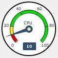
Notice the setting columns start from "Left red zone end", this literally means you can have red zones at beginning and at the end too.For your needs these settings should work:
Minimum value : 0.0
Maximum value : 100.0
Left red zone end : 10.0 (end at 10.0, meaning it starts from Minimum value)
Left yellow zone end : 20.0 (end at 20.0, starting from Left red zone end)
(green zone between)
Right yellow zone start : 100.0 (starts "after" Maximum value - not showing yellow zone)
Right red zone start : 100.0 (starts "after" Maximum value - not showing red zone)
Place legend inside dial only moves the legend inside the dial and it comes from data source Display name (in my case I used CPU DCI).Attached dial how it looks:
-
Hello! It looks like you're interested in this conversation, but you don't have an account yet.
Getting fed up of having to scroll through the same posts each visit? When you register for an account, you'll always come back to exactly where you were before, and choose to be notified of new replies (either via email, or push notification). You'll also be able to save bookmarks and upvote posts to show your appreciation to other community members.
With your input, this post could be even better 💗
Register Login